Your CTA Is in a Dead Zone: The Mobile Thumb Map Every US Advertiser Needs on Their Wall
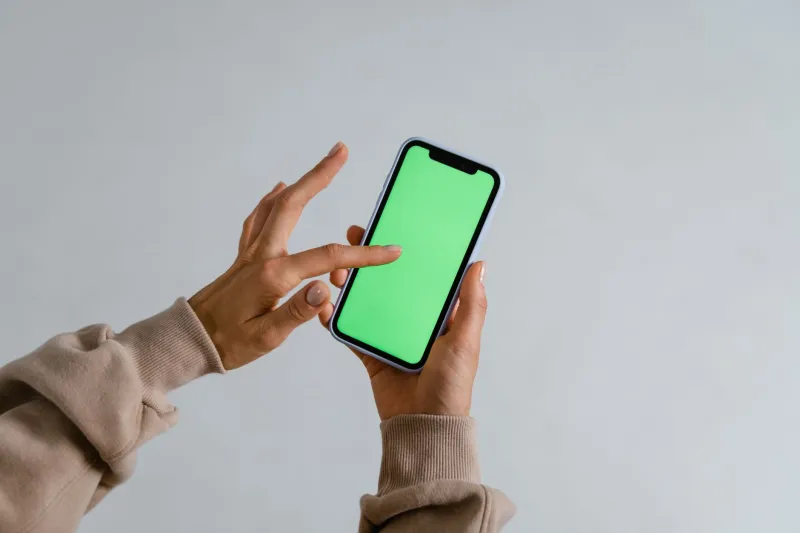
Picture how you're holding your phone right now. One hand, thumb doing all the work, screen tilted slightly toward you. Maybe you're on the couch. Maybe you're in line at a Starbucks. Either way, you're not sitting at a desk with a mouse and a 27-inch monitor — and neither are the majority of people seeing your ads.
US mobile web traffic crossed 60% of total internet usage a while back and has kept climbing. Yet walk into most digital marketing teams and pull up their creative briefs, and you'll find landing pages and ad layouts still designed around desktop logic. Centered CTAs that look great on a MacBook. Hero images optimized for widescreen. Button sizes that make sense when you're clicking with a cursor but become a finger-mashing frustration on a 6-inch screen.
This isn't a minor UX gripe. It's a conversion leak hiding in plain sight.
The Anatomy of the American Thumb
UX researcher Steven Hoober's foundational mobile usability study — updated and expanded over the years — mapped out how people actually hold and interact with their smartphones. The findings are consistent: roughly 75% of users interact with their phones using one thumb, and the natural arc of that thumb creates distinct zones of screen real estate with very different engagement profiles.
The bottom-center of the screen is the sweet spot — easy to reach, natural motion, low friction. Moving toward the top of the screen, especially the top corners, engagement drops sharply. Users can reach those areas, but it requires a grip shift or a second hand. That small amount of added effort is enough to introduce hesitation — and hesitation is where conversions go to die.
Think of it as three rough zones on a standard smartphone screen:
- Easy zone: Bottom third of the screen, center-weighted. This is where taps happen naturally and comfortably.
- Stretch zone: Middle section and side edges. Reachable but requires minor adjustment.
- Dead zone: Top third of the screen, particularly the upper corners. Users avoid tapping here unless they're highly motivated.
Now go look at where your primary CTA button lives on your mobile landing page. If it's above the fold near the top of the screen, you've placed your most important conversion element in the hardest-to-reach real estate on the device.
How This Quietly Tanks Your CTR
The damage doesn't always show up in a dramatic metric collapse. It's subtler than that, which is part of why it persists. Users don't consciously think, "I'm not clicking because this button is hard to reach." They just feel a small friction — a moment of awkwardness — and the impulse fades. They scroll past. They close the tab. They tell themselves they'll come back later (they won't).
For e-commerce brands, this friction compounds across the entire purchase funnel. A product page CTA in the dead zone means fewer add-to-carts. A checkout button that requires a grip shift means more abandoned carts. Studies from Baymard Institute have repeatedly shown that mobile checkout abandonment rates in the US hover around 85% — and while reasons vary, interface friction is a consistent contributor.
For local service businesses running lead gen campaigns — think HVAC, dental practices, home remodeling — the stakes are even higher. Users are often searching on the go, in a moment of need, with low patience. If your "Call Now" or "Get a Free Quote" button isn't immediately tappable with one thumb, that lead is going to your competitor whose form loads faster and sits lower on the screen.
The Redesign Checklist Your Mobile Ads Actually Need
Optimizing for thumb zones isn't about blowing up your creative from scratch. It's about making targeted, intentional adjustments that reduce friction at the exact moment a user is ready to convert.
1. Anchor your primary CTA at the bottom of the screen. For landing pages, a sticky bottom bar with your CTA button is one of the highest-impact, lowest-effort changes you can make. It stays in the easy zone regardless of where the user is in the page. Multiple case studies from e-commerce brands show sticky mobile CTAs lifting conversion rates by 15–30% compared to static above-fold placements.
2. Make your tap targets fat enough to actually hit. Apple's Human Interface Guidelines recommend a minimum tap target size of 44x44 points. Google's Material Design guidelines suggest 48x48 dp. In practice, many ad creatives and landing page buttons fall well below this. A button that looks fine on a design mockup can be a fingertip nightmare on an actual device. Test on real phones, not just browser simulators.
3. Keep forms short and thumb-friendly. Every field you add to a mobile lead form is another opportunity for frustration. For lead gen campaigns targeting US audiences, the sweet spot is typically name, email, and maybe one qualifying question. Auto-fill compatibility is non-negotiable. If users have to hunt-and-peck through a six-field form on a phone keyboard, your completion rate will reflect that misery.
4. Rethink your ad creative for vertical first. Static display ads designed as horizontal banners and then squished into mobile placements are a conversion tax you're paying voluntarily. Design your social and display assets natively for vertical formats — 9:16 for Stories and Reels, square for feed placements. Your CTA overlay should sit in the lower portion of the frame, not centered at the top.
5. Test your pages on actual devices, in actual conditions. This sounds obvious. It isn't done often enough. Pull up your landing page on an iPhone SE (a smaller screen than many teams assume their audience uses), hold it the way a real person holds a phone, and try to complete the conversion action with one thumb. Where does it break down? That's your roadmap.
Industry Snapshots: Where the Gains Are Biggest
Not every vertical feels this pain equally. A few where mobile thumb optimization tends to move the needle most:
- E-commerce: Cart and checkout CTAs are the critical friction points. Sticky add-to-cart bars and one-tap payment options (Apple Pay, Google Pay) dramatically reduce drop-off.
- Local services: Click-to-call buttons need to be prominent, bottom-anchored, and large. Users calling a plumber at 11pm aren't in a patient mood.
- Lead generation (finance, insurance, real estate): Short, autofill-friendly forms with bottom-of-screen submit buttons consistently outperform traditional above-fold form designs on mobile.
The Bottom Line
Mobile isn't the future of digital advertising in America — it's the present, and has been for years. The brands still designing for a desktop cursor are leaving real money in the dead zones of their users' screens.
The fix isn't complicated. Map your thumb zones. Anchor your CTAs where thumbs actually land. Build your creative for the device your audience is holding, not the one sitting on your designer's desk. Small shifts in placement and sizing can unlock conversion gains that no amount of copy tweaking will match — because friction happens before the brain even gets to the words.
Click smarter. That starts with knowing where the clicks actually come from.