Half a Second to Win or Lose: How Your Brain Picks a Winner Before You've Read a Single Word

Half a Second to Win or Lose: How Your Brain Picks a Winner Before You've Read a Single Word
Forget A/B testing button colors for a week. Before your audience ever processes your headline, your offer, or your value proposition, their brain has already issued a verdict. Engage or ignore. Tap or scroll. That decision — made in roughly 50 milliseconds — is driven almost entirely by instinct, biology, and deeply wired cognitive shortcuts that no amount of copywriting can override if your visual presentation fails the test.
For US marketers running paid search, display, or social ads, this is either terrifying news or the most powerful insight you've gotten all year. We're going with the latter.
The 50-Millisecond Verdict
Researchers at Carleton University in Ottawa published a landmark study showing that users form aesthetic judgments about websites in as little as 50 milliseconds — and those snap judgments are remarkably stable. A follow-up impression 10 seconds later rarely changes the initial gut reaction. Your ad creative faces the same brutal court.
This isn't about conscious preference. It's about the brain's threat-detection and reward-anticipation systems running in parallel. The visual cortex processes shape, contrast, and spatial relationships almost instantaneously. If what it sees feels chaotic, cluttered, or inconsistent with expectations, the brain flags it as low-value and the thumb keeps moving. If the visual signal feels clean, credible, and relevant — even subconsciously — attention lingers long enough for the rational brain to get involved.
That's the window you're designing for. Not the full session. Just long enough to survive the cull.
Visual Hierarchy Does the Heavy Lifting
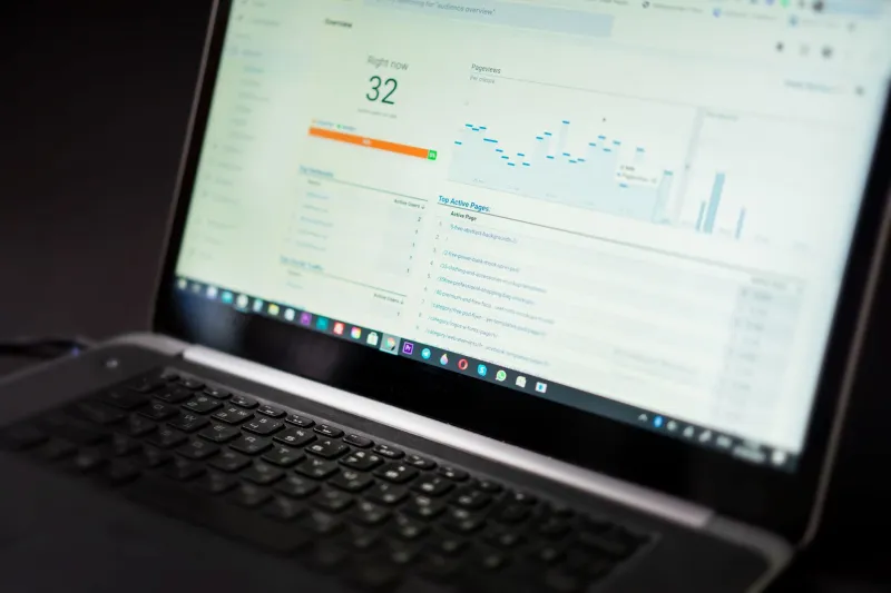
Eye-tracking studies from the Nielsen Norman Group consistently show that users don't read web content in a linear way. They scan in patterns — typically an F-shape on text-heavy pages or a spotted pattern on image-heavy layouts — and their gaze is pulled by contrast, size, and position before it's pulled by words.
What this means practically: the biggest, boldest, most visually dominant element in your ad or landing page is going to receive attention first, regardless of whether it's the element you want them to see first. If your logo is the most visually prominent thing on a display ad, that's what the brain registers. Your offer becomes secondary. Your CTA becomes an afterthought.
Smart visual hierarchy means deliberately engineering a viewing path. Lead with the tension — the problem, the desire, or the contrast — then guide the eye toward resolution. Use size and weight to establish priority, not decoration.
Color Contrast Isn't Just Aesthetic — It's Neurological
Human vision evolved to detect edges and contrasts. Our ancestors needed to spot movement against a background, identify ripe fruit on a green vine. That same wiring now determines whether your CTA button pops off the page or disappears into it.
High contrast between a button and its surrounding background doesn't just look good — it triggers a low-level alert response in the visual system. The brain notices it faster. Studies from UX research firm CXL have shown that CTA buttons with strong contrast ratios can outperform low-contrast alternatives by double-digit percentage points in click-through rate, with no other variables changed.
For US advertisers, this has a cultural layer too. American consumers are exposed to roughly 4,000 to 10,000 ads per day, depending on the estimate you trust. Pattern recognition kicks in hard. If your ad looks like every other ad in the feed, the brain categorizes it as ambient noise and filters it out before conscious attention ever fires. Contrast — not just in color, but in layout, framing, and creative approach — is how you interrupt that filter.
Cognitive Load: The Silent Conversion Killer
Even if you win the first 50 milliseconds, you can still lose the next five seconds. Cognitive load — the mental effort required to process what you're looking at — is the second gate your creative has to pass through.
A cluttered landing page, an ad with three competing messages, or a layout where the eye doesn't know where to go next all spike cognitive load. And when processing feels hard, the brain defaults to avoidance. It's not laziness; it's efficiency. The brain is a calorie-conservation machine, and it will abandon tasks that feel unnecessarily complicated.
The fix isn't dumbing things down. It's removing friction. Every element on your ad or page should earn its place by either reinforcing the core message or guiding the user toward action. If it does neither, it's cognitive noise — and it's costing you clicks.
Practical moves: limit your ad to a single visual focal point, use white space aggressively, and never ask the user to make more than one decision at a time. The brain loves clear paths. Give it one.
What Real Ads Get Right (And What They Get Catastrophically Wrong)
Take a look at high-performing Google Display ads from major US e-commerce brands during Q4. The ones with the best CTR share a few traits: they use a single dominant image with clear subject focus, a headline in no more than six words, a CTA button that contrasts sharply with the background, and — critically — they leave breathing room. The visual field isn't packed.
Now look at the underperformers. Multiple competing headlines, product images stacked without hierarchy, CTAs that blend into the design, logos competing with messaging for dominance. These ads fail the 50-millisecond test before anyone reads a word.
Landing pages follow the same rules. Above-the-fold content should communicate value and create visual tension toward a single action. Anything that delays or distracts from that path is reducing your conversion rate, even if it feels like it's adding context.
Engineering Clicks Before the First Word
So what's the actionable takeaway for US digital marketers? Think of your creative assets as visual arguments, not written ones. Before your copy can persuade, your layout has to invite. Before your offer can convert, your design has to survive the brain's instant triage.
Run your ads through a five-second test — show them to someone unfamiliar with your brand for five seconds, then ask what they remember. If the answer isn't your core message and your CTA, your visual hierarchy needs work. Use heat mapping tools on your landing pages to see where attention actually lands versus where you intended it to go. And audit your contrast ratios — not just for accessibility compliance, but for pure click-grabbing power.
The brands that are winning the attention battle in 2025 aren't necessarily the ones with the biggest budgets. They're the ones who understand that the click starts in the brain, not on the page — and they design accordingly.