Your Ad Looked Great in the Office. Here's Why It's Falling Apart on Everyone Else's Screen

Your Ad Looked Great in the Office. Here's Why It's Falling Apart on Everyone Else's Screen
There's a specific kind of advertiser heartbreak that doesn't show up in your dashboard right away. It hides in a slightly-too-low CTR. In a conversion rate that should be higher based on your targeting. In bounce rates that don't match your landing page quality.
Sometimes the culprit isn't your offer, your audience, or your bid strategy. It's simpler and more embarrassing than that: your ad looks broken on the screen your customer is actually using.
And you never noticed because you only ever looked at it on yours.
The American Screen Landscape Is Chaotic (In the Best and Worst Way)
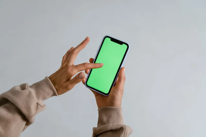
US consumers aren't browsing from a standardized device in a controlled environment. They're on a 6-year-old Android phone with a cracked screen during a lunch break in Cincinnati. They're on a high-resolution MacBook Pro in a dimly lit apartment in Austin with dark mode enabled. They're on a mid-range Windows laptop with a browser zoom set to 125% because their vision isn't what it used to be.
According to Statista, mobile accounts for well over half of US web traffic — but that "mobile" category spans hundreds of device types, screen resolutions, and operating system versions. Add desktop and tablet into the mix, and you're looking at an enormous range of rendering environments, each capable of making your carefully crafted creative look slightly (or dramatically) different.
The problem is that most advertisers proof their creative on one screen — usually their primary work monitor — and call it done. That's like taste-testing a recipe with one ingredient and declaring it finished.
The Most Damaging Display Failures (And Where They Hide)
Truncated Headlines on Mid-Size Android Screens
Google's responsive search ads give you up to 30 characters per headline, but that doesn't mean all 30 will display across all placements on all devices. Android devices with smaller physical screens — still extremely common in the US market — often render ads at widths that cut off longer headlines mid-word or mid-thought.
The result? "Get Your Free Quote Today — No Commitment Req..." Your entire value proposition, severed. And you'd never know unless you tested on that specific screen width.
Fix it: Write your most critical message into the first 20–25 characters of your primary headlines. Treat anything after that as bonus real estate, not essential information.
Washed-Out Visuals in Facebook and Instagram Dark Mode
Dark mode adoption has exploded across the US, with a significant portion of smartphone users running it full-time. Facebook and Instagram respect system-level dark mode settings, which means ads with white or very light backgrounds can render with an inverted or dimmed appearance depending on the platform version and device.
Transparent PNG images are especially vulnerable. A product shot with a transparent background that looks clean and professional on a white-background browser can appear to float on a dark grey void in dark mode — or worse, show a white rectangle that looks like a rendering error.
Fix it: Always export ad images with solid background colors rather than transparency where possible. If transparency is necessary, test your creative with a dark mode simulator before launch. Tools like Responsively App or browser dev tools can help you preview this quickly.
Oversized Text That Reflows on Tablet Layouts
Tablets occupy an awkward middle ground that many advertisers completely ignore. An ad designed with a mobile layout in mind can look stretched and clunky on a 10-inch tablet. Text that looked proportional on a phone can reflow into unexpected line breaks on a tablet, making your carefully written copy read as fragmented and amateurish.
Display ads are particularly vulnerable here. A 320x50 mobile banner scaled up to fill a tablet browser column doesn't just look low-quality — it signals to the viewer that this brand didn't care enough to get the basics right. And that impression happens fast.
Fix it: Use Google's responsive display ad format and upload multiple asset sizes rather than relying on a single image to scale. The platform will serve the most appropriate version for each placement.
Video Ads That Auto-Play Silently — With No Captions
The majority of social video in the US plays on mute by default. If your video ad leads with 10 seconds of spoken dialogue and no captions, you've lost the viewer before they've heard a single word. They see lips moving, maybe a nice background, and then they scroll.
This is less a display inconsistency and more a consumption behavior mismatch — but the effect on your CTR is just as damaging.
Fix it: Burn captions directly into your video file rather than relying on platform auto-captions (which are inconsistent in accuracy). Open with a strong visual hook and on-screen text that communicates value within the first 3 seconds, regardless of audio.
CTA Buttons That Disappear on High-Brightness Outdoor Screens
Many US consumers interact with ads outdoors — commuting, at outdoor dining spots, walking between meetings. High ambient light washes out screen contrast dramatically. A light blue CTA button on a white background that looks elegant on your calibrated monitor becomes nearly invisible to someone squinting at their phone in the afternoon sun in Phoenix.
Contrast isn't just an accessibility concern. It's a conversion concern.
Fix it: Check your CTA color combinations against WCAG contrast ratio guidelines (aim for at least 4.5:1 for normal text). High-contrast pairings — dark navy on white, white on deep green — hold up across ambient light conditions far better than trendy low-contrast designs.
A Pre-Launch Creative Checklist That Actually Gets Used
The goal isn't to test on every possible device — that's not realistic. The goal is to catch the most common failure points before they drain budget. Here's a quick checklist to run before any ad goes live:
Headlines and Copy
- Primary message fits within 20–25 characters (for search ads)
- No critical information in extensions that may not always show
- Copy reads naturally at 125% browser zoom
Visuals
- Tested in both light and dark mode
- No transparent backgrounds on images intended for social
- Uploaded in multiple size variants for display placements
Video
- Captions burned in (not platform-generated)
- Strong visual hook in first 3 seconds without audio
- Tested with screen brightness maxed out
CTA
- Contrast ratio checked against WCAG guidelines
- Button is visible and tappable on a 5-inch phone screen
- CTA text doesn't truncate on any tested device
Final Check
- Previewed on at least one mobile device, one desktop, and one tablet
- Checked in Chrome, Safari, and Firefox (covers the majority of US browser share)
- Ran through Google Ads' ad preview and diagnosis tool for search placements
The Clicks You're Losing Are Invisible
The frustrating thing about creative display failures is that they don't trigger an alert. Your ads keep running. Your budget keeps spending. But somewhere between your publish button and your customer's screen, something breaks — and the click that should have happened simply doesn't.
Smarter clicking starts before the campaign launches. A 20-minute creative audit across a handful of real devices and display conditions can recover CTR that you didn't even know you were losing. And at TopClicking, those are exactly the kinds of wins that add up fast.